Compose Multi-Platform Colours and Fonts

Colours can be specified in a variety of ways, including:

Background Colour

Hello World!

Colour can't simply be applied to the Window background. Instead colour is applied to the Row and/or Column containers within using Modifiers.

fun main() = singleWindowApplication(
    title = "Coloured Window"
) {
    App()
}

@Composable
fun App() {
    Column(
        modifier = Modifier.fillMaxSize().background(Color.Cyan)
    ) {
        Text("Hello World!")
    }
}

Text Colour

Hello World from Kotlin Compose MP!

Colour can be applied to any text by setting the color parameter to the desired colour.

fun main() = singleWindowApplication(
    title = "Coloured Text"
) {
    App()
}

@Composable
fun App() {
    Column() {
        Text(
            text = "Hello World",
            color = Color.Red
        )

        Text(
            text = "from",
            color = Color.Green
        )

        Text(
            text = "Kotlin Compose MP!",
            color = Color.Blue
        )
    }
}

Button Colour

Colours can be applied to buttons by setting a backgroundColor and contentColor value (see the example code).

fun main() = singleWindowApplication(
    title = "Coloured Text"
) {
    App()
}

@Composable
fun App() {
    Row() {
        Button(
            onClick = {...},
            colors = ButtonDefaults.buttonColors(
                backgroundColor = Color.Red,
                contentColor = Color.White
            )
        ) {
            Text("A")
        }

        Button(
            onClick = {...},
            colors = ButtonDefaults.buttonColors(
                backgroundColor = Color.Green,
                contentColor = Color.White
            )
        ) {
            Text("B")
        }

        Button(
            onClick = {...},
            colors = ButtonDefaults.buttonColors(
                backgroundColor = Color.Blue,
                contentColor = Color.White
            )
        ) {
            Text("C")
        }
    }
}

Borders

Hello World! Hello World!

Containers such as Rows and Columns can have borders added to them using the border Modifier.

Note that the Modifier order is important: Add borders and backgrounds before padding.

fun main() = singleWindowApplication(
    title = "Borders"
) {
    App()
}

@Composable
fun App() {
    Row() {
        Column(
            modifier = Modifier
                .border(4.dp, Color.Green)
                .background(Color.Yellow)
                .padding(30.dp)
        ) {
            Text("Hello")
            Text("World!")
        }

        Column(
            modifier = Modifier
                .border(4.dp, Color.Blue)
                .background(Color.Cyan)
                .padding(30.dp)
        ) {
            Text("Hello")
            Text("World!")
        }
    }
}

Text Size, Weight and Style

Hello World! Hello World! Hello World! Hello World!

The size, weight and style of text can be modified using fontWeight, fontStyle and fontSize parameters.

fun main() = singleWindowApplication(
    title = "Styled Text"
) {
    App()
}

@Composable
fun App() {
    Column() {
        Text("Hello World!", fontWeight = FontWeight.Bold)
        Text("Hello World!", fontStyle = FontStyle.Italic)
        Text("Hello World!", fontSize = 30.sp)
        Text("Hello World!", fontSize = 60.sp)
    }
}

Text Fonts

The default font for all UI elements has been altered to this monstrosity... Don't ever do this!
This text has a different font specified

Fonts can be loaded and used, either as the default font for the whole UI, or on an individual text element.

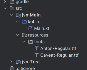
Font files should be placed into a 'fonts' folder within the resources folder inside your project (see here). TrueType (TTF) fonts should be used.

Note, make sure the correct Font class is imported: androidx.compose.ui.text.platform.Font

val antonFont  = FontFamily(Font("fonts/Anton-Regular.ttf"))
val caveatFont = FontFamily(Font("fonts/Caveat-Regular.ttf"))

fun main() = singleWindowApplication(
    title = "Fonts"
) {
    App()
}

@Composable
fun App() {
    // Set the default font for the app
    MaterialTheme(
        typography = Typography(defaultFontFamily = caveatFont)
    ) {
        Column() {
            // All elements will use default font...
            Text("The default font for all UI elements ...")

            Row() {
                OutlinedTextField(
                    label = { Text("Name") },
                    value = "Jimmy Smith",
                    onValueChange = {...}
                )

                Button(onClick = {}) { Text("Press Me!") }
            }

            // ... unless a different font is specified
            Text(
                "This has a different font specified",
                fontFamily = antonFont
            )
        }
    }
}

Themed Example 1

My Important Notes Organise a get-together with the girls Meet Jimmy for lunch Contact the bank about my lost Bitcoins Bank password: ThisIsMySecret123 Need to think of a good way to get rich

This example note-taking app shows off various theming techniques: custom fonts; background, button and text colours; custom borders; etc.

val antonFont  = FontFamily(Font("fonts/Anton-Regular.ttf"))
val caveatFont = FontFamily(Font("fonts/Caveat-Regular.ttf"))

val backCol   = Color(0xfffff176)
val accentCol = Color(0xffd32f2f)

fun main() = singleWindowApplication(
    title = "Notes"
) {
    App()
}

@Composable
fun App() {
    MaterialTheme(
        typography = Typography(defaultFontFamily = caveatFont)
    ) {
        Column(
            modifier = Modifier.background(backCol)
        ) {
            Text(
                "My Important Notes",
                fontFamily = antonFont,
                fontSize = 30.sp,
                color = accentCol
            )

            Column() {
                Text(notes[0], fontSize = 20.sp )
                Text(notes[1], fontSize = 20.sp )
                Text(notes[2], fontSize = 20.sp )
                Text(notes[3], fontSize = 20.sp )
                Text(notes[4], fontSize = 20.sp )
            }

            Row() {
                OutlinedTextField(
                    value = newNote,
                    onValueChange = {...},
                    modifier = Modifier.border(3.dp, accentCol)
                )

                Button(
                    onClick = {...},
                    colors = ButtonDefaults.buttonColors(
                        backgroundColor = accentCol,
                        contentColor = Color.White
                    )
                ) {
                    Text("+")
                }
            }
        }
    }
}

Themed Example 2

Fenrick Greenleaf Druid Able to call on the elemental forces of nature and can emulate the creatures of the animal world. An embodiment of nature's resilience, cunning, and fury. STR10 DEX17 CON9 INT12 WIS18 CHA11

This example game window showing some player stats, shows off various theming techniques: custom font, background and text colours, borders, etc.

val antonFont = FontFamily(Font("fonts/Anton-Regular.ttf"))

val backCol   = Color(0xff37474f)
val borderCol = Color(0xff263238)
val panelCol  = Color(0xff90a4ae)

fun main() = singleWindowApplication(
    title = "Player Stats"
) {
    App()
}

@Composable
fun App() {
    Row(
        modifier = Modifier.background(backCol)
    ) {
        Image(
            painter = painterResource(playerImage),
            contentDescription = "Player image",
            modifier = Modifier.border(4.dp, borderCol)
        )

        Column() {
            Text(
                playerName,
                fontFamily = antonFont,
                fontSize = 30.sp,
                color = Color(0xffffca28)
            )

            Row() {
                Column(
                    modifier = Modifier
                        .background(panelCol)
                        .border(4.dp, borderCol)
                ) {
                    Text(playerClass)

                    Text(
                        playerDescription,
                        fontSize = 12.sp
                    )
                }

                Column(
                    modifier = Modifier
                        .background(panelCol)
                        .border(4.dp, borderCol)
                ) {
                    Row() {
                        Text("STR")
                        Text(
                            playerStrength,
                            fontWeight = FontWeight.Bold
                        )
                    }
                    Row() {
                        Text("DEX")
                        Text(
                            playerDexterity,
                            fontWeight = FontWeight.Bold
                        )
                    }
                    Row() {
                        Text("CON")
                        Text(
                            playerConstitution,
                            fontWeight = FontWeight.Bold
                        )
                    }
                    Row() {
                        Text("INT")
                        Text(
                            playerIntelligence,
                            fontWeight = FontWeight.Bold
                        )
                    }
                    Row() {
                        Text("WIS")
                        Text(
                            playerWisdom,
                            fontWeight = FontWeight.Bold
                        )
                    }
                    Row() {
                        Text("CHA")
                        Text(
                            playerCharisma,
                            fontWeight = FontWeight.Bold
                        )
                    }
                }
            }
        }
    }
}

Note that these examples have spacing added around elements to help show how the layouts work. The code snippets don't apply the same spacing.